Documentation
This page includes all designed elements which you may use while creating sites based on this template.
Start ExploringGetting Started
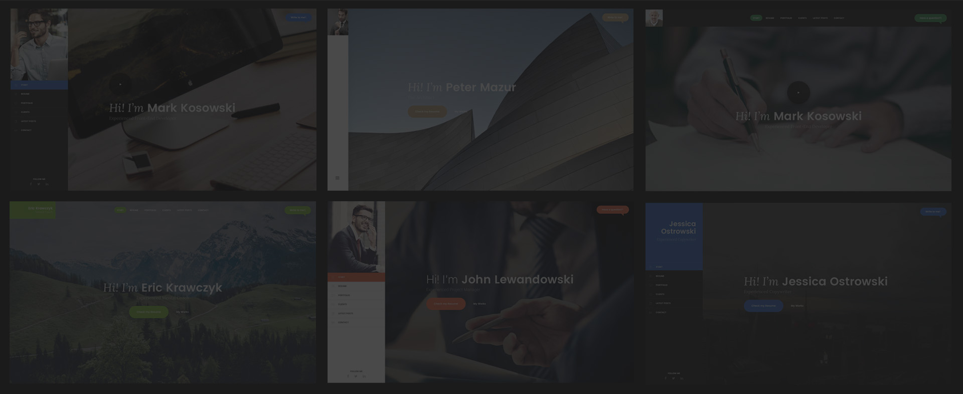
Sukces is a HTML/CSS template based on Bootstrap 3 framework. It allows to built impressive, better & faster, mobile friendly websites.
HTML Structure
This is the base of each HTML file:
<!-- Header -->
<header id="header">
    ...
</header>
<!-- Header / End -->

<!-- Content -->
<div id="content">

	<!-- Section -->
	<section>
		...
	</section>

</div>
<!-- Content / End -->
Grid System
Sukces Template supporst all features of Bootstrap Grid System - go to Bootrstrap's page and check how does it work.
CSS Elements
Thanks to awesome CSS elements you will be able to prepare unusual websites in the fastest and the easiest way. Check them out!
Available Colors
Colour scheme:
Other:
Typography
Headings
h1. Bootstrap heading
h2. Bootstrap heading
h3. Bootstrap heading
h4. Bootstrap heading
h5. Bootstrap heading
h6. Bootstrap heading
<h1>h1. Bootstrap heading</h1>
<h2>h2. Bootstrap heading</h2>
<h3>h3. Bootstrap heading</h3>
<h4>h4. Bootstrap heading</h4>
<h5>h5. Bootstrap heading</h5>
<h6>h6. Bootstrap heading</h6>
Paragraph
Maecenas a risus quis ipsum convallis fringilla in ut magna. Phasellus et sagittis odio. Sed in enim condimentum, lacinia metus id, sollicitudin libero. In ac ultricies justo.
Curabitur sit amet turpis eu diam luctus viverra. Sed viverra ornare ex, quis lobortis diam vehicula a. In imperdiet est tristique, malesuada odio quis, volutpat ante. Nulla ullamcorper, nisl sed faucibus posuere, dui turpis mattis turpis, in porttitor massa odio nec sapien.
<p class="lead">...</p>
<p>...</p>
Blockquote
Lorem ipsum dolor sit amet, consectetur adipiscing elit. Integer posuere erat a ante.
<blockquote>
    <p>Lorem ipsum dolor sit amet, consectetur adipiscing elit. Integer posuere erat a ante.</p>
    <footer>
        <img src="..." alt="">
        <div class="content">
            <span class="name">Jerry Nowak</span>
            <div class="caption">CEO at Google Inc.</div>
        </div>
    </footer>
</blockquote>
Labels
Default
Primary
Success
Info
Warning
Danger
Images
Pagination
<ul class="pagination">
    <li><a href="#" aria-label="Previous"><i class="fa fa-chevron-left"></i></a></li>
    <li class="active"><a href="#">1</a></li>
    <li><a href="#">2</a></li>
    <li><a href="#">3</a></li>
    <li><a href="#" aria-label="Next"><i class="fa fa-chevron-right"></i></a></li>
</ul>
Icons
Sukces template includes three fantastic sets of icons - Font Awesome, Themify Icons, Stroke 7
Basic Icons
Circle Icons
Colors
Each icon may be used in any color from Available Colors section. Please use .icon-[color-name] - for example:
Hover effect
Icons provides nice hover effect by adding .icon-hover class.
Social Icons
This product supports lots of social icon types.
Forms
To validate the form please add .validate-form class and required atribute to input / textarea.
<div class="form-group">
    <label for="exampleInput">Input:</label>
    <input type="email" class="form-control" id="exampleInput" placeholder="Email">
</div>
<div class="form-group">
    <label for="exampleTextarea">Textarea:</label>
    <textarea class="form-control" id="exampleTextarea" placeholder="Example Textarea"></textarea>
</div>
Alerts
<div class="alert alert-success" role="alert">
    ...
</div>
<div class="alert alert-info" role="alert">
    ...
</div>
<div class="alert alert-warning" role="alert">
    ...
</div>
<div class="alert alert-danger" role="alert">
    ...
</div>
Timelines
Front-End Developer
Envato, Sydney, Australia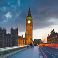 08.2010 - 09.2011
Webdesigner & Front End Developer
Envato, Sydney, AustraliaFront-End Developer
Envato, Sydney, Australia
<div class="timeline">
<!-- Event-->
<div class="timeline-event animated">
<div class="content">
<span class="date">08.2010 - 09.2011</span>
<h4>Front-End Developer</h4>
<span class="caption">Envato, Sydney, Australia</span>
</div>
</div>
<!-- Event-->
<div class="timeline-event animated">
<div class="content">
<img src="assets/img/photos/london.jpg" alt="" class="img-rounded">
<span class="date">08.2010 - 09.2011</span>
<h4>Webdesigner & Front End Developer</h4>
<span class="caption">Envato, Sydney, Australia</span>
</div>
</div>
<!-- Event-->
<div class="timeline-event animated">
<div class="content">
<span class="date">08.2010 - 09.2011</span>
<h4>Front-End Developer</h4>
<span class="caption">Envato, Sydney, Australia</span>
</div>
</div>
</div>
Each event on timeline may have diffrent color from Available Colors section by using .te-[color-name] class.
Helper Classes
Text Colors
It is possible to add any color form Available Colors section by .text-[color-name] class
Fusce dapibus, tellus ac cursus commodo, tortor mauris nibh.
Backgrounds
Similar to text colors it is possible to add backgorund color from Available Colors section by .bg-[color-name] class.
For dark background colors it is necessary to add dark class to adjust font colors and other styles. Sometimes, if inside dark element is placed element with light background you should add light class to such element.
Fusce dapibus, tellus ac cursus commodo, tortor mauris nibh.
<p class="bg-success dark p-20">Fusce dapibus, tellus ac cursus commodo, tortor mauris nibh.</p>
Free Space
It is possible to add free spaces to the site by using special classes base of this scheme: .[type][direction]-[value].
[type]- sets type of free space - m (margin), p (padding)[direction]- sets direction of free space (optional) - t (top), r (right), b (bottom), l (left)[value]- sets value of free space - 0, 5, 10 ... 200
<div class="bg-primary dark pt-60 pb-60 pl-30 pr-30">Box with 60px vertical padding and 30px horizontal padding</div>
Border
It is possible to add border to any of html elements by adding proper class:
.border- adds border to element.border-top- adds top border to element.border-bottom- adds bottom border to element
<div class="pb-10 border-bottom">Element with border-bottom and 20px bottom padding</div>
Heights & vertical center position
The template allows to set minimial height of block html element. It is possible by using .h-[value] class.
[value] is a number from 100 to 900 with 100 gap or sm (40% of viewport), md (60% of viewport) and lg (80% of viewport).
By .fullheight class you set elements height equal to the browser viewport height.
Using .v-center class makes element positioned vertically center in relation to the parent.
<div class="h-200 border"><div class="p-20 v-center">Element in vertical center position inside 200px container with border.</div></div>
More useful helper classes are listed on Bootstrap's 3 website!
Components
Thanks to the prepared components you will be able to create really cool and effective, easy to use websites. Let's start exploring them!
Accordions
Accordions present informations in collapsable panels.
<!-- Accordion -->
<div class="panel-group" role="tablist" aria-multiselectable="true">
    <!-- Panel -->
    <div class="panel panel-2">
        <div class="panel-heading" role="tab">
            <h4 class="panel-title">
                <a data-toggle="collapse" href="#collapseOne" aria-expanded="false">How does it works?</a>
            </h4>
        </div>
        <div id="collapseOne" class="panel-collapse collapse" role="tabpanel">
            <div class="panel-body">
            ...
            </div>
        </div>
    </div>
    <!-- Panel -->
    <div class="panel panel-2">
        <div class="panel-heading" role="tab">
            <h4 class="panel-title">
                <a data-toggle="collapse" href="#collapseTwo" aria-expanded="false">How to start working with HTML/CSS template?</a>
            </h4>
        </div>
        <div id="collapseTwo" class="panel-collapse collapse" role="tabpanel">
            <div class="panel-body">
            ...
            </div>
        </div>
    </div>
    <!-- Panel -->
    <div class="panel panel-2">
        <div class="panel-heading" role="tab">
            <h4 class="panel-title">
                <a data-toggle="collapse" href="#collapseThree" aria-expanded="false">How does it works?</a>
            </h4>
        </div>
        <div id="collapseThree" class="panel-collapse collapse" role="tabpanel">
            <div class="panel-body">
            ...
            </div>
        </div>
    </div>
</div>
Pricing tables
Present your services with their prices!
<div class="row">
<div class="col-md-4">
    <!-- Price Table -->
    <div class="price-table">
        <div class="head bg-grey">
            <h4>Starter</h4>
            <span class="price">$99</span>
        </div>
        <div class="content">
            <ul>
                <li><i class="i-before ti-check text-primary"></i>3 templates per month</li>
                <li><i class="i-before ti-check text-primary"></i>6 months support</li>
                <li><i class="i-before ti-check text-primary"></i>Free Updates</li>
            </ul>
            <a href="#" class="btn btn-filled btn-primary"><i class="i-before ti-shopping-cart"></i> Purchase</a>
        </div>
    </div>
</div>
<div class="col-md-4">
    <!-- Price Table -->
    <div class="price-table">
        <div class="head bg-primary dark">
            <h4>Standard</h4>
            <span class="price">$149</span>
        </div>
        <div class="content">
            <ul>
                <li><i class="i-before ti-check text-primary"></i>3 templates per month</li>
                <li><i class="i-before ti-check text-primary"></i>6 months support</li>
                <li><i class="i-before ti-check text-primary"></i>Free Updates</li>
            </ul>
            <a href="#" class="btn btn-filled btn-primary"><i class="i-before ti-shopping-cart"></i> Purchase</a>
        </div>
    </div>
</div>
<div class="col-md-4">
    <!-- Price Table -->
    <div class="price-table">
        <div class="head bg-grey">
            <h4>Unlimited</h4>
            <span class="price">$299</span>
        </div>
        <div class="content">
            <ul>
                <li><i class="i-before ti-check text-primary"></i>3 templates per month</li>
                <li><i class="i-before ti-check text-primary"></i>6 months support</li>
                <li><i class="i-before ti-check text-primary"></i>Free Updates</li>
            </ul>
            <a href="#" class="btn btn-filled btn-primary"><i class="i-before ti-shopping-cart"></i> Purchase</a>
        </div>
    </div>
</div>
</div>
Progress Bars
Present the data on this easy to use progress bars.
To set color of progress bar please add the .progress-bar-[color-name] class, where [color-name] is a name of color from Available Colors section.
<div class="progress">
    <div class="progress-bar progress-bar-success" role="progressbar" aria-valuenow="60" aria-valuemin="0" aria-valuemax="100" style="width: 60%;">60%</div>
</div>
Tabs
Feel free to use the tabs for dynamic content.
<!-- Nav tabs -->
<nav class="tabs-wrapper mb-20">
	<ul class="nav nav-tabs">
		<li role="presentation" class="active"><a href="#home" aria-controls="home" role="tab" data-toggle="tab">Home</a></li>
   	 	<li role="presentation"><a href="#profile" aria-controls="profile" role="tab" data-toggle="tab">Profile</a></li>
    	<li role="presentation"><a href="#messages" aria-controls="messages" role="tab" data-toggle="tab">Messages</a></li>
	</ul>
	<span class="selector"></span>
</nav>
<!-- Tab panes -->
<div class="tab-content">
    <div role="tabpanel" class="tab-pane fade in active" id="home">...</div>
    <div role="tabpanel" class="tab-pane fade" id="profile">...</div>
    <div role="tabpanel" class="tab-pane fade" id="messages">...</div>
</div>
Modal
Modal window is perfect place for any kind of content.
<!-- Button trigger modal -->
<button type="button" class="btn btn-blue btn-lg" data-toggle="modal" data-target="#demoModal"><span>Launch demo modal</span></button>

<!-- Modal / Demo -->
<div class="modal fade" id="demoModal" role="dialog">
	<div class="modal-dialog" role="document">
		<div class="modal-content">
			<div class="modal-header">
				<button type="button" class="close" data-dismiss="modal" aria-label="Close"><i class="ti-close"></i></button>
				<h4 class="modal-title" id="myModalLabel">Modal title</h4>
			</div>
			<div class="modal-body">
				...
			</div>
			<div class="modal-footer">
				<button type="button" class="btn btn-default" data-dismiss="modal">Close</button>
				<button type="button" class="btn btn-primary">Save changes</button>
			</div>
		</div>
	</div>
</div>
Sizes
Modals have three optional sizes .modal-sm, .modal-lg available via modifier classes to be placed on a .modal-dialog.
Video Modal
Video Modal was created to place video in popup window. Use data-video attribute to place url to your video.
<!-- Button trigger modal -->
<a href="#" class="btn-play btn-lg mb-30" data-toggle="video-modal" data-target="#modalVideo" data-video="https://www.youtube.com/embed/uVju5--RqtY"></a>

<!-- Video Modal / Demo -->
<div class="modal modal-video fade" id="modalVideo" role="dialog">
    <button class="close" data-dismiss="modal"><i class="ti-close"></i></button>
    <div class="modal-dialog modal-lg" role="document">
        <div class="modal-content">
            <iframe height="500"></iframe>
        </div>
    </div>
</div>
Sizes
Modals have three optional sizes .modal-sm, .modal-lg available via modifier classes to be placed on a .modal-dialog.
Ajax Modal
Load dynamic content by Ajax using special modal windows.
#content selector in your HTML file.<!-- Ajax Trigger --> <a href="..." class="btn btn-primary btn-lg" data-toggle="ajax-modal"><span>Load example ajax modal</span></a> <!-- Mandatory elements somewhere at the end of body --> <!-- Ajax Modal --> <div id="ajax-modal"></div> <!-- Ajax Close --> <a href="#" class="ajax-close" data-dismiss="ajax-modal"><i class="ti-close"></i></a> <!-- Ajax Loader --> <svg id="ajax-loader" class="loader" width="65px" height="65px" viewBox="0 0 66 66" xmlns="http://www.w3.org/2000/svg"><circle class="circle" fill="none" stroke-width="3" stroke-linecap="round" cx="33" cy="33" r="30"></circle></svg>
Carousel
Carousel is a really cool element to preset any kind of content like photos, icons, texts, etc.
To use carousel it is necessary to set some attribuites to .carousel element:
data-items- sets the maximum amount of items displayed at a time with the widest browser width.data-single-item- sets single item carouseldata-auto-play- adds auto slideshow which value is the slide speed (default 3000)data-pagination- disables / enables paginationdata-navigation- disables / enables navigation
<!-- Carousel -->
<div class="carousel" data-items="3" data-pagination="true" data-navigation="true">
    <div class="slide">...</div>
    <div class="slide">...</div>
    <div class="slide">...</div>
    <div class="slide">...</div>
    <div class="slide">...</div>
</div>
Tooltips
Hover the buttons to see the tooltips.
Configuration
The template includes some configurable elements - here you will find informations how to use them!
Google Map
To configure Google Map it is necessary to set latitude and longitude parameters by data-latitude and data-longitude attributes of #google-map element. To get it please visit site like this.
<div id="google-map" class="h-400" data-latitude="40.758895" data-longitude="-73.985131"></div>
Map supports light and dark color themes - to set it please use data-style attribute.
Contact Form
To configure contact form please open contact-form.php file from /assets/php directory and go the line with an e-mail address to change it to your own - like this.
$emailTo = 'your@email.com';
After that you will recieve the messages from your websites to this e-mail address.
Aniamtions
The template allows to add really cool animations for each of html elements. Let's check how to use it!
Entrance animation
This animation fires when element appears in the browser viewport. To add such animation you need to place .animated class in the animted element and preciese which animation do you want to use by data-animationattribute. It is also possible to add some delay to the animation (in ms) by data-animation-delay attribute.
RTL Mode
To set RTL mode to the template you need to:
- Add
dir="rtl"tohtmlselector. - Include Bootstrap RTL Stylesheet
<link rel="stylesheet" href="assets/css/bootstrap-rtl.min.css" />
Files & Credits
CSS Files
The template uses mainly 3 CSS files:
styles.css- compressed file with all necessary plugins, fonts and animations styles (more at credicts)themes/theme-[type].css- main template file with couple of types:- sans_serif-beige
- sans_serif-blue
- sans_serif-bottle
- sans_serif-green
- sans_serif-orange
- sans_serif-purple
- sans_serif-red
- sans_serif-teal
- serif-beige
- serif-blue
- serif-bottle
- serif-green
- serif-orange
- serif-purple
- serif-red
- serif-teal
- Document Setup
- Basic
- Header
- Content
- Elements
- Widgets
- Animations
Documentation uses one addiotional prettify.css stylesheet for code highlighter.
SASS Files
CSS files are generated thanks to well organized SCSS files.
├── _animations.scss
├── _base.scss
├── _basics.scss
├── _config.scss
├── _content
│   ├── _blog.scss
│   ├── _features.scss
│   ├── _media.scss
│   ├── _other.scss
│   ├── _sections.scss
│   ├── _testimonials.scss
│   └── _timeline.scss
├── _content.scss
├── _elements
│   ├── _accordion.scss
│   ├── _ajax-modal.scss
│   ├── _backgrounds.scss
│   ├── _breadcrumbs.scss
│   ├── _buttons.scss
│   ├── _carousel.scss
│   ├── _contact-popup.scss
│   ├── _forms.scss
│   ├── _icons.scss
│   ├── _images.scss
│   ├── _labels-badges.scss
│   ├── _loader.scss
│   ├── _modals.scss
│   ├── _navs.scss
│   ├── _other.scss
│   ├── _pagination.scss
│   ├── _price-tables.scss
│   ├── _progress-bars.scss
│   └── _typography.scss
├── _elements.scss
├── _header
│   ├── _header-horizontal-rtl.scss
│   ├── _header-horizontal.scss
│   ├── _header-vertical-rtl.scss
│   └── _header-vertical.scss
├── _header.scss
├── _setup.scss
├── _widgets.scss
├── theme-sans_serif-beige.scss
├── theme-sans_serif-blue.scss
├── theme-sans_serif-bottle.scss
├── theme-sans_serif-green.scss
├── theme-sans_serif-orange.scss
├── theme-sans_serif-purple.scss
├── theme-sans_serif-red.scss
├── theme-sans_serif-teal.scss
├── theme-serif-beige.scss
├── theme-serif-blue.scss
├── theme-serif-bottle.scss
├── theme-serif-green.scss
├── theme-serif-orange.scss
├── theme-serif-purple.scss
├── theme-serif-red.scss
└── theme-serif-teal.scss
theme-[type].scssis a main SCSS file where main colors have been set._base.cssfile is a base for each theme which imports other partials._config.cssfile with SASS variables which configure colors, fonts and more.
JavaScript Files
On the end of the body of each html file there are placed 4 JavaScrpt files:
jquery-1.12.3.min.js- compressed file with necessary plugins, fonts and animations styles (more at credicts)plugins.js- compressed file with all necessary plugins sources (more at credicts)core.js- main JavaScript filehttp://maps.google.com/maps/api/jsGoogle Map API
Elements page uses one addiotional prettify.js plugin for code highlighter.
PHP Files
The template includes few PHP scripts:
/php/contact-form.php- configuration file for contact form
Credits
Fonts:
- Lora - https://fonts.google.com/specimen/Lora?query=lora
- Poppins - https://fonts.google.com/specimen/Poppins?query=poppins
- Roboto - hhttps://fonts.google.com/specimen/Roboto?query=roboto
- Font Awesome - http://fortawesome.github.io/Font-Awesome/
- Themify Icons - http://themify.me/themify-icons
- Stroke 7http://themes-pixeden.com/font-demos/7-stroke/
Libraries:
- jQuery - http://jquery.com/
- Bootstrap 3 - http://getbootstrap.com/
Plugins:
- Appear - http://morr.github.io/appear.html
- Easing - http://gsgd.co.uk/sandbox/jquery/easing/
- LocalScroll - http://flesler.blogspot.com/2007/10/jquerylocalscroll-10.html
- ScrollTo - https://github.com/flesler/jquery.scrollTo
- Waypoint - http://imakewebthings.com/waypoints/
- Masonry - http://masonry.desandro.com/
- ImagesLoaded - http://imagesloaded.desandro.com/
- OwlCarousel - http://owlgraphic.com/owlcarousel/
- WaitForImages - https://github.com/alexanderdickson/waitForImages
- Validate - https://jqueryvalidation.org/
- Typed - http://www.mattboldt.com/demos/typed-js/
- jquery.mb.YTPlayer - http://pupunzi.open-lab.com/mb-jquery-components/jquery-mb-ytplayer/
- Prettify - https://github.com/google/code-prettify
Images:
Some of images cannot be included in download package, and have been blurred for licensing reasons.
Included images:
- https://www.pexels.com/photo/imac-mac-screen-desk-30776/
- https://www.pexels.com/photo/architecture-building-modern-24547/
- https://www.pexels.com/photo/business-signing-writing-writer-24193/
- https://www.pexels.com/photo/no-person-architecture-contemporary-glass-108052/
- https://www.pexels.com/photo/architecture-building-expo-museum-6737/
- https://www.pexels.com/photo/snow-mountains-sky-clouds-108486/
- https://www.pexels.com/photo/sea-nature-sunny-beach-913/
- https://www.pexels.com/photo/guy-city-looking-person-34051/
- https://www.pexels.com/photo/autumn-fall-nature-wallpaper-nature-17577/
- https://www.pexels.com/photo/sunset-sunny-sun-women-54566/
- https://www.pexels.com/photo/whiteboard-sketching-design-planning-7366/
Other:
- Bootstrap RTL - https://github.com/morteza/bootstrap-rtl
- Animate.css - http://daneden.github.io/animate.css/
Changelog
===============================================================
v 1.01 - 10.10.2017
===============================================================

FIX    - Local Scroll fix

Files affected:
---------------------------------------------------------------
UPDATE - jquery.localScroll.js, jquery.scrollTo.js, plugins.js