Documentation
This page includes all designed elements which you may use while creating sites based on this template.
Start Exploring Go to chooserGetting Started
Hajs is a HTML/CSS template based on Bootstrap 4 framework. It allows to built modern, fast and mobile friendly landing pages.
HTML Structure
This is the base of each HTML file:
<!-- Header -->
<header id="header">
    ...
</header>
<!-- Header / End -->

<!-- Content -->
<div id="content">

	<!-- Section -->
	<section>
		...
	</section>

    <!-- Footer -->
    <footer>
        ...
    </footer>

</div>
<!-- Content / End -->
Grid System
Hajs Template supporst all features of Bootstrap Grid System - go to Bootrstrap's page and check how does it work.
Content
It will be pleasure to build content with this stuff!. More at Bootstrap's 4 page.
Typography
Useful elements to create nice texts.
Headings
h1. Bootstrap heading
h2. Bootstrap heading
h3. Bootstrap heading
h4. Bootstrap heading
h5. Bootstrap heading
h6. Bootstrap heading
<h1>h1. Bootstrap heading</h1>
<h2>h2. Bootstrap heading</h2>
<h3>h3. Bootstrap heading</h3>
<h4>h4. Bootstrap heading</h4>
<h5>h5. Bootstrap heading</h5>
<h6>h6. Bootstrap heading</h6>
Paragraph
Maecenas a risus quis ipsum convallis fringilla in ut magna. Phasellus et sagittis odio. Sed in enim condimentum, lacinia metus id, sollicitudin libero. In ac ultricies justo.
Curabitur sit amet turpis eu diam luctus viverra. Sed viverra ornare ex, quis lobortis diam vehicula a. In imperdiet est tristique, malesuada odio quis, volutpat ante. Nulla ullamcorper, nisl sed faucibus posuere, dui turpis mattis turpis, in porttitor massa odio nec sapien.
<p class="lead">...</p>
<p>...</p>
Blockquote

It’s the best device I have ever used!
<!-- Blockquote -->
<blockquote class="blockquote">
    <img src="assets/img/avatars/avatar01.jpg" alt="" class="image">
    <div class="rate">
        <i class="fa fa-star active"></i>
        <i class="fa fa-star active"></i>
        <i class="fa fa-star active"></i>
        <i class="fa fa-star active"></i>
        <i class="fa fa-star"></i>
    </div>
    <p>It’s the best device I have ever used!</p>
    <footer>Poul McCartney, Smashing Magazine</footer>
</blockquote>
Code
Easy & effectife way to resent code. More at Bootstrap's 4 page.
Inline code
<section> should be wrapped as inline.
For example, <code><section></code> should be wrapped as inline.
Code block
<p>Sample text here...</p>
<p>And another line of sample text here...</p>
<pre><code><p>Sample text here...</p> <p>And another line of sample text here...</p> </code></pre>
Images
<img src="..." alt="..." class="rounded">
<img src="..." alt="..." class="img-thumbnail">
Icons
Hajs template includes two fantastic sets of icons - Themify Icons and Line Icons
Basic Icons
Circle Icons
Colors
Each icon may be used in any color from Available Colors section. Please use .icon-[color-name] - for example:
Social Icons
This product supports lots of social icon types.
Components
Thanks to the prepared components you will be able to create really cool and effective, easy to use websites. Let's start exploring them!
Alerts
<div class="alert alert-success" role="alert">
    ...
</div>
<div class="alert alert-info" role="alert">
    ...
</div>
<div class="alert alert-warning" role="alert">
    ...
</div>
<div class="alert alert-danger" role="alert">
    ...
</div>
Forms
To validate the form please add .validate-form class and required atribute to input / textarea.
<form action="#" id="contact-form" class="contact-form validate-form"
    data-message-error="Opps... Something went wrong - please try again later"
    data-message-success="Thanks! You will recieve a responsve in 24h!"
    >
    <div class="form-group">
        <label>Your e-mail</label>
        <input name="email" type="email" class="form-control" required>
    </div>
    <div class="form-group">
        <label>Your message</label>
        <textarea name="message" id="message" cols="30" rows="5" class="form-control" required></textarea>
    </div>
    <div class="form-group form-submit">
        <button type="submit" class="btn btn-primary btn-block">Send message!</button>
    </div>
</form>
Pagination
<ul class="pagination">
    <li class="page-item">
        <a class="page-link" href="#" aria-label="Previous">
            <i class="ti-angle-left"></i>
            <span class="sr-only">Previous</span>
        </a>
    </li>
    <li class="page-item"><a class="page-link" href="#">1</a></li>
    <li class="page-item active"><a class="page-link" href="#">2</a></li>
    <li class="page-item"><a class="page-link" href="#">3</a></li>
    <li class="page-item"><a class="page-link" href="#">4</a></li>
    <li class="page-item"><a class="page-link" href="#">5</a></li>
    <li class="page-item">
        <a class="page-link" href="#" aria-label="Next">
            <i class="ti-angle-right"></i>
            <span class="sr-only">Next</span>
        </a>
    </li>
</ul>
Tabs
Feel free to use the tabs for dynamic content.
<!-- Nav tabs -->
<ul class="nav nav-tabs mb-3" role="tablist">
    <li class="nav-item">
        <a class="nav-link active" href="#home" aria-controls="home" role="tab" data-toggle="tab">Home</a>
    </li>
    <li class="nav-item">
        <a class="nav-link" href="#profile" aria-controls="profile" role="tab" data-toggle="tab">Profile</a>
    </li>
    <li class="nav-item">
        <a class="nav-link" href="#messages" aria-controls="messages" role="tab" data-toggle="tab">Messages</a>
    </li>
</ul>
<!-- Tab panes -->
<div class="tab-content">
    <div role="tabpanel" class="tab-pane fade in active" id="home">...</div>
    <div role="tabpanel" class="tab-pane fade" id="profile">...</div>
    <div role="tabpanel" class="tab-pane fade" id="messages">...</div>
</div>
Modal
Modal window is perfect place for any kind of content.
<!-- Button trigger modal -->
<button type="button" class="btn btn-blue btn-lg" data-toggle="modal" data-target="#demoModal"><span>Launch demo modal</span></button>

<!-- Modal / Demo -->
<div class="modal fade" id="demoModal" role="dialog">
	<div class="modal-dialog" role="document">
		<div class="modal-content">
			<div class="modal-header">
				<h4 class="modal-title" id="myModalLabel">Modal title</h4>
                <button type="button" class="close" data-dismiss="modal" aria-label="Close"><i class="ti-close"></i></button>
			</div>
			<div class="modal-body">
				...
			</div>
			<div class="modal-footer">
				<button type="button" class="btn btn-dark" data-dismiss="modal">Close</button>
				<button type="button" class="btn btn-primary">Save changes</button>
			</div>
		</div>
	</div>
</div>
Sizes
Modals have three optional sizes .modal-sm, .modal-lg available via modifier classes to be placed on a .modal-dialog.
Video Modal
Video Modal was created to place video in popup window. Use data-video attribute to place url to your video.
<!-- Button trigger modal -->
<a href="#" class="btn-play-2" data-toggle="video-modal" data-target="#modalVideo" data-video="https://www.youtube.com/embed/uVju5--RqtY"><span></span>Check it now!</a>

<!-- Video Modal / Demo -->
<div class="modal modal-video fade" id="modalVideo" role="dialog">
    <button class="close" data-dismiss="modal"><i class="ti-close"></i></button>
    <div class="modal-dialog modal-lg" role="document">
        <div class="modal-content">
            <iframe height="500"></iframe>
        </div>
    </div>
</div>
Carousel
Carousel is a component perfect to preset any kind of content like photos, icons, texts, etc. Go to the Slick's page to see full documentation of this components.




<!-- Carousel -->
<div class="carousel carousel-items" data-slick='{
    "slidesToShow": 3,
    "slidesToScroll": 1,
    "dots": true,
    "arrows": false,
    "responsive": [
        {
            "breakpoint": 991,
            "settings": {
                "slidesToShow": 2
            }
        },
        {
            "breakpoint": 575,
            "settings": {
                "slidesToShow": 1
            }
        }
    ]
    }'>
    <div class="carousel-item">
        ...
    </div>
    <div class="carousel-item">
        ...
    </div>
    <div class="carousel-item">
        ...
    </div>
    <div class="carousel-item">
        ...
    </div>
    <div class="carousel-item">
        ...
    </div>
</div>
Badges
Default
Primary
Success
Info
Warning
Danger
Tooltips
Hover the buttons to see the tooltips.
Utilities
Below are listed important configuration options for whole template.
Available Colors
Colour scheme:
primary
secondary
Other:
info
success
warning
danger
light
white
dark
black
Helper Classes
Text Colors
It is possible to add any color form Available Colors section by .text-[color-name] class
Fusce dapibus, tellus ac cursus commodo, tortor mauris nibh.
Backgrounds
Similar to text colors it is possible to add backgorund color from Available Colors section by .bg-[color-name] class.
For dark background colors it is necessary to add dark class to adjust font colors and other styles. Sometimes, if inside dark element is placed element with light background you should add light class to such element.
Fusce dapibus, tellus ac cursus commodo, tortor mauris nibh.
<p class="bg-success dark p-2">Fusce dapibus, tellus ac cursus commodo, tortor mauris nibh.</p>
Border
It is possible to add border to any of html elements by adding proper class:
.border- adds border to element.border-top- adds top border to element.border-bottom- adds bottom border to element
<div class="pb-10 border-bottom">Element with border-bottom.</div>
Heights & vertical center position
The template allows to set minimial height of block html element. It is possible by using .h-[value] class.
[value] is a number from 100 to 900 with 100 gap or sm (40% of viewport), md (60% of viewport) and lg (80% of viewport).
By .fullheight class you set elements height equal to the browser viewport height.
Using .v-center class makes element positioned vertically center in relation to the parent.
H2 inside 200px container.
<div class="bg-light h-200">
    <h2 class="text-center mb-0 v-center">H2 inside 200px container.</h2>
</div>
More useful helper classes are listed on Bootstrap's 4 website!
Configuration
The template includes some configurable elements - here you will find informations how to use them!
Google Map
To configure Google Map it is necessary to set latitude and longitude parameters by data-latitude and data-longitude attributes of #google-map element. To get it please visit site like this.
<div id="google-map" class="h-400" data-latitude="40.758895" data-longitude="-73.985131" data-style="dream"></div>
Map supports few color themes - to set it please use data-style attribute.
Available Themes
- wy
- apple
- dark
Contact Form
To configure contact form please open contact-form.php file from /assets/php directory and go the line with an e-mail address to change it to your own - like this.
$emailTo = 'your@email.com';
After that you will recieve the messages from your websites to this e-mail address.
SignUp Form

SignUp form is made with Mailchimp API.
How to create the form?
- Log into the Mailchimp site.
- Create subscribers list.

- Get into the list and go to "Signup forms" tab.

- Pick "Embedded forms".

- Pick "Classic version" and copy / paste somewhere generated code (don't change anything).
- Find
formselector and copyactionatribute valuse into your form. Remember to addmethod="POST"attribute. - Modify action URI by changing
.../post?...to.../post-json?.... It should look like thisaction="//suelo.us12.list-manage.com/subscribe/post-json?u=ed47dbfe167d906f2bc46a01b&id=24ac8a22ad" - Find email input and copy
type,nameandidto your input - it should look like this:<input type="email" value="" name="EMAIL" class="form-control input-lg" id="mce-EMAIL"> - Find input which prevents bot signups and paste it somewhere in the form - it should be hidden!
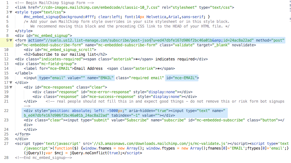
- Add submit button and enjoy your working Sign Up form!
Local Scroll
If you want to use local scroll somewhere in the content please add data-local-scroll attribute in the parent selector of a link to local selector.
Aniamtions
The template allows to add really cool animations for each of html elements. Let's check how to use it!
Entrance animation
This animation fires when element appears in the browser viewport. To add such animation you need to place .animated class in the animted element and preciese which animation do you want to use by data-animationattribute. It is also possible to add some delay to the animation (in ms) by data-animation-delay attribute.
Developer Tools
The template was made with NPM package manager and Grunt.js task manager.
NPM
The template includes two package.json files:
package.json
This file includes necessary grunt tasks to make developemnt process nice and easy. Run npm install task to install them.
assets/plusings/package.json
This file includes all plugins used in this theme. To install those plugins you need to run npm install as previously but after that you have to run grunt copy and grunt removetasks to move them into right directory
Grunt.js
The package includes some grunt tasks to make development process easier:
grunt- runsgrunt sasstasks after each .scss file changegrunt sass- compiles all .scss filesgrunt cssmin- creates one css with plugins stylesheetsgrunt uglify- creates one js file with all pluginsgrunt validation- makes HTML5 validation of each .html file
Files & Credits
CSS Files
The template uses mainly 3 CSS files:
plugins-bundle.css- compressed CSS file with all necessary plugins.(more at credicts)icons-bundle.css- compressed CSS file with icons.(more at credicts)[type]/theme_[color-scheme].css- main template file with 3 types:- rounded
- classic
- slab
- blue-green
- green-black
- mint-orange
- orange-blue
- purple-teal
- red-ashy
1. Setup
2. Basic
3. Header
4. Content
-- 4.1 Blog
-- 4.2 Features
-- 4.3 Intro
-- 4.4 Members
-- 4.5 Other
-- 4.6 Page Title
-- 4.7 Product
-- 4.8 Steps
-- 4.9 Timeline
5. Footer
6. Elements
-- 6.1 Alerts
-- 6.2 Backgrounds
-- 6.3 Badges
-- 6.4 Buttons
-- 6.5 Carousel
-- 6.6 Forms
-- 6.7 Icons
-- 6.8 Loader
-- 6.9 Messenger
-- 6.10 Modals
-- 6.11 Navigations
-- 6.12 Notification Bar
-- 6.13 Other
-- 6.14 Pagination
-- 6.15 Testimonials
-- 6.16 Typography
7. Widgets
8. Animations
Documentation uses one addiotional prettify.css stylesheet for code highlighter.
SASS Files
CSS files are generated thanks to well organized SCSS files.
├── _animations.scss
├── _base.scss
├── _basics.scss
├── _config.scss
├── _content
│   ├── _blog.scss
│   ├── _features.scss
│   ├── _intro.scss
│   ├── _members.scss
│   ├── _other.scss
│   ├── _page-title.scss
│   ├── _product.scss
│   ├── _steps.scss
│   └── _timeline.scss
├── _content.scss
├── _elements
│   ├── _alerts.scss
│   ├── _backgrounds.scss
│   ├── _badges.scss
│   ├── _buttons.scss
│   ├── _carousel.scss
│   ├── _forms.scss
│   ├── _icons.scss
│   ├── _loader.scss
│   ├── _messenger.scss
│   ├── _modals.scss
│   ├── _navs.scss
│   ├── _notification-bar.scss
│   ├── _other.scss
│   ├── _pagination.scss
│   ├── _testimonials.scss
│   └── _typography.scss
├── _elements.scss
├── _footer.scss
├── _header.scss
├── _setup.scss
├── _widgets.scss
├── package.json
├── theme_blue-green.scss
├── theme_green-black.scss
├── theme_mint-orange.scss
├── theme_orange-blue.scss
├── theme_purple-teal.scss
└── theme_red-ashy.scss
theme_[color-scheme].scssis a main SCSS file where main colors have been set._base.cssfile is a base for each theme which imports other partials._config.cssfile with SASS variables which configure colors, fonts and more.
JavaScript Files
On the end of the body of each html file there are placed 4 JavaScrpt files:
plugins-bundle.js- compressed file with all necessary plugins sources (more at credicts)core.js- main JavaScript filehttps://maps.googleapis.com/maps/api/jsGoogle Map API
Instead of plugins-bundle.js it is also possible to use full plugins list:
<script src="assets/plugins/jquery/dist/jquery.min.js"></script>
<script src="assets/plugins/tether/dist/js/tether.min.js"></script>
<script src="assets/plugins/bootstrap/dist/js/bootstrap.min.js"></script>
<script src="assets/plugins/slick-carousel/slick/slick.min.js"></script>
<script src="assets/plugins/jquery.appear/jquery.appear.js"></script>
<script src="assets/plugins/jquery.scrollto/jquery.scrollTo.min.js"></script>
<script src="assets/plugins/jquery.localscroll/jquery.localScroll.min.js"></script>
<script src="assets/plugins/waypoints/lib/jquery.waypoints.min.js"></script>
<script src="assets/plugins/waypoints/lib/shortcuts/sticky.min.js"></script>
<script src="assets/plugins/jquery-validation/dist/jquery.validate.min.js"></script>
<script src="assets/plugins/jquery.mb.ytplayer/dist/jquery.mb.YTPlayer.min.js"></script>
<script src="assets/plugins/masonry-layout/dist/masonry.pkgd.min.js"></script>
<script src="assets/plugins/imagesloaded/imagesloaded.pkgd.min.js"></script>
<script src="assets/plugins/twitter-fetcher/js/twitterFetcher_min.js"></script>
<script src="assets/plugins/skrollr/dist/skrollr.min.js"></script>
Elements page uses one addiotional assets/js/prettify.js plugin for code highlighter.
PHP Files
The template includes few PHP scripts:
/php/contact-form.php- configuration file for contact form
Credits
Fonts:
- Nunito - https://fonts.google.com/specimen/Nunito
- Roboto - https://fonts.google.com/specimen/Roboto
- Roboto Slab - https://fonts.google.com/specimen/Roboto+Slab
Icons:
- Themify Icons - http://themify.me/themify-icons
- Font Awesome - fontawesome.io/
- Line Icons https://blog.fps.hu/274-vector-line-icons-for-free/
- Flag Icons https://github.com/lipis/flag-icon-css
Libraries:
- jQuery - http://jquery.com/
- Bootstrap 4 - http://v4-alpha.getbootstrap.com/
Plugins:
- Tether - http://tether.io/
- Moment - http://momentjs.com/
- Appear - http://morr.github.io/appear.html
- LocalScroll - http://flesler.blogspot.com/2007/10/jquerylocalscroll-10.html
- ScrollTo - https://github.com/flesler/jquery.scrollTo
- Validate - https://jqueryvalidation.org/
- Twitter Post Fetcher - https://github.com/jasonmayes/Twitter-Post-Fetcher
- Waypoint - http://imakewebthings.com/waypoints/
- Masonry - http://masonry.desandro.com/
- ImagesLoaded - http://imagesloaded.desandro.com/
- Slick - http://kenwheeler.github.io/slick/
- jquery.mb.YTPlayer - http://pupunzi.open-lab.com/mb-jquery-components/jquery-mb-ytplayer/
- Prettify - https://github.com/google/code-prettify
- Skrollr - https://github.com/Prinzhorn/skrollr
npm install; grunt copy; grunt remove tasks in /assets/plugins/.
Images:
Some images used in the template was free and have been included in a package. Rest of them was blurred becouse of licensing reasons.
Included images:
- https://www.pexels.com/photo/grey-and-white-snow-covered-mountains-and-white-cloud-bank-65125/
- https://www.pexels.com/photo/man-wearing-blue-denim-buttons-up-long-sleeve-and-blace-frame-eyelgasses-26939/
- https://www.pexels.com/photo/nature-sky-summer-sun-34066/
- https://www.pexels.com/photo/black-frame-eyeglasses-near-white-ceramic-mug-70232/
- https://www.pexels.com/photo/man-wearing-eyeglasses-41115/
- https://www.pexels.com/photo/redneck-man-fashion-model-24257/
- https://www.pexels.com/photo/woman-in-black-blazer-jacket-on-wooden-bench-206559/
- https://www.pexels.com/photo/man-in-red-and-blue-v-neck-shirt-101584/
- https://www.pexels.com/photo/adult-business-desk-document-296886/
Changelog
What has changed since first version?